Monday, April 27, 2020


LUCY SPALDING
CANDIDATE NUMBER 1666
CLAREMONT FAN COURT SCHOOL 64680

I worked with SARAH MILLARD 1648MAX GREEN 1629,  YUE CHUN CHAM 0972

Our brief was to make film trailers (full and teaser) for a fictional thriller film. The title of our film is III DAYS. I have collated diversified research posts as-well as developed plans involving our film opening, III DAYS. These of which can be found below on the main blog roll below incorporated within diversified platforms and tools. This includes Twitter, Facebook, Instagram, YouTube, Google Forms, Photoshop, Piktochart, Pinterest, Visme, Canva, Prezi, SlideShare, Wix, final cut pro and adobe after affects. 

EDITING:
While everyone has been involved within the final production, we each contributed with differing approaches when it came to editing. Moreover I excelled when editing the newspaper and investigation board. Here I utilised multiple hard cuts, with short burst clips. In essence, enigma is quickly established as the whole image is hidden from the audience, but instead is portrayed in sections. This can also be seen when delivering the newspaper report scene. 

DIRECTING:
My main directing role consisted of integrating reflective surfaces to capture the more prominent visuals. The concept behind this was to further allude to the audience that he's being unknowingly watched. Here I led the process by selecting the most effective surfaces, as well as controlling the angle and lighting used.

CAMERAWORK:
During the trailers filming process, I took independence when integrating more interesting camera shots into each scene, equally building greater suspense. In particular, this can be seen when our protagonist Jack Masters, recieves his third and final letter. The utilisation of a match shot along with shot reverse shots to captures his facial expression and after one of the trailers most detrimental scenes.  

Saturday, March 7, 2020

CONSTRUCTION: FILM POSTER

I utilised the editing software Adobe Photoshop when creating a film poster as one of my three products as a marketing tactic. Through this process I was able to further establish my perception of important key conventions, and furthermore was able to develop my editing skills as I grew more familiar with the platform. 


To start I began by changing the curves of the picture to develop a deeper contrast between the highlights and shadows involved within the background image. This provided an area of lighter distinction which formed in centre page. 


I also added a monochrome tint of about 5% to the poster, while leaving the red strings exposedThe use of the monochromatic colour provides visual cohesion which helps to support the tone of the poster through the connotative colour created. The relative absence of hue contrast introduces a sinister style. 


Imported visuals added consisted of the Title, Billing board, Awards and Actor names; all of which are the conventions of a successful film poster. I further edited the film award/ festival names to increase sophistication and establish the films credibility. A red outline was used as a technique to grab the audiences attention. 


Moreover, after realising the lack of excitement as expressed through the poster, I decided to incorporate a dripping blood effect onto the "III" of the title. Furthermore, I favoured a more captivating effect, this of which I was able to achieve by linking the poster visuals with the Title in a coupled approach. This signifies to the audience the relationship and impact of time within the plot. The left side of the title incorporates less string, while the right provides an overwhelming extent which is to be seen as a reflection to the plot thickening

I added a tagline and social medias to follow the typical conventions associated with a respectably credited thriller film poster. shadow itself represents the blocking out of light, the addition of shadows behind the varying text formats symbolise a lurking darkness, which can be further connoted to resemble uncertainty

My Final Product:

Monday, March 2, 2020

CONSTRUCTION: NOTIONS OF LOOKING

The issues that the trailer opens up, involve society’s sense of insecurity about our personal safety in an age of surveillance and internet cybercrime. Jack’s home, a warm haven with soft lighting, locked doors and a comfortable buffer of wealth, is disturbed by unexplained threats and intrusions. He is plunged into a state of uncertainty and vulnerability in the very place where he should be safe. This is suggested by visual codes like reflective surfaces (the mirror, the silver globe bowl) which imply that someone else is spying on him, that there is a voyeur in the house. Who is doing the looking?

We were able to convey through visual codes and camera work; by contrasting between the safe environment of Jacks home, and the illusion of someone watching him. Therefore when constructing specific scenes we placed our protagonist in reflective shots to capture the essence of personal invasion.

Wednesday, February 12, 2020

CONSTRUCTION: BBFC CERTIFICATE


We constructed our BBFC using photoshopDue to our film opening containing moderate threat along with infrequent mild violence, we decided a classification of 15 was appropriate. The next age classification, an 18, would need to demonstrate 'sadistic threat'. Our category allows violence to be strong but should not dwell on infliction of pain or injury. The strongest gory images are unlikely to be accepted.


Monday, February 10, 2020

CONSTRUCTION: IDENT

Loading...
Loading...

Sunday, February 9, 2020

CONSTRUCTION: TITLE

Loading...
Loading...

Saturday, February 1, 2020

CONSTRUCTION: INVESTIGATION BOARD

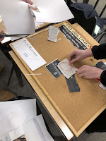
When planning, we envisioned concluding our trailer with a climatic scene. Through incorporating a montage of varying extreme close ups, our group were able to amplify the tension, building the scene to climaxWe utilised a range of props in order to bring the investigation board to life. In doing so we tore up news paper, combined paperclips/ pinssticky notes (with written dates) as well as our previously constructed envelopes. Mutually, we agreed red string would bring the board together - the sinister and striking colour would play an essential role in captivating our audience.  


Thursday, January 30, 2020

CONSTRUCTION: SOCIAL MEDIA


SOCIAL MEDIA:
As part of distributing our film, we devised various marketing strategies in order to reach our target audience:

* TWITTER * FACEBOOK  * INSTAGRAM  * P&A (A FILM POSTER):

We created our own Twitter feed and posted material that related to our movie genre and our target markets interests. This involved trailers from thriller films, re-tweets from well known thriller directors and tweets that I wrote which give an insight into our films plot.


InstagramINSTAGRAM LINK HERE
We chose Instagram as our first marketing strategy due our familiarity with the social platform: most people of our age – that is, our target audience- are the same. Once we developed an account name, we moved onto our biography content 'Three anonymous letters are mysteriously posted in a teenage boys letter box. The images contain people who are then murdered 'III days' after receiving the letters; the final letter of the three is him.' Here we explained our film in the hope of drawing our target audience in. Once we attracted an audience we were able to maintain them as followers, allowing us to remain in contact through our feed/profile; keeping them informed.


Poster:
P&A has traditionally been an important element in film marketing campaigns. In order to explore how we might design a suitable poster for our thriller, I took into account various genre codes & conventions such as colour, lighting, drama, striking visuals and the element of enigma. I created a poster using Photoshop. Here I included a title, release date, key positions, a billing block and social media. 


Facebook: FACEBOOK LINK HERE
I created the Facebook page, I ensured the name title was simple like the other social media platforms we created which is why 'FILM.3DAYS' was the most effective name for this page. Similarly to Instagram I included some information in a biography style which states 'Three anonymous letters are mysteriously posted in a teenage boys letter box. The images contain people who are then murdered 'III days' after receiving the letters; the final letter of the three is him.' Like our biography on Instagram, this includes enough information for the audience to understand enough about our film opening but not too much that there is no big question or suspense/mystery that will cause the audience to want to find out more.
I chose to use the same profile picture as our other social media platforms as I believed it was vital in helping our target audience know that each of these social media platforms belonged to our production company. The cover picture seen at the top I made the title name of our film which was the title which appears at the end of our film opening, I did this because it creates a clear link between our film opening and the Facebook account. On the Facebook page I posted our film poster and this would further captivate our audience along with the other elements on this page. 


Wednesday, January 8, 2020

CONSTRUCTION: PROPS

For our film, we need to consider our props before we begin shooting. As we discussed what props may be needed we realised there are many. I have collated them into a list here with a collage of props we will use:


  • Three letters of victims with names and faces
  • Newspaper of Oliva Blake being 'Missing'
  • Radio
  • Handcufs


In the making of this prop, we used Photoshop. We infused a previous newspaper article which we drew from the internet as a template:

In the editing process, we inserted our own title and re-cut the template to fit that of a newspaper article. Furthermore, we decided to insert a screenshot from one of the laboratory scenes, We believe this created a clear link between the separate scenes. 
In creating a more realistic touch to the newspaper article, we printed an A3 sized copy and tinted the colouring of the paper, using the technique of tea bags. To finish it off, we then stuck it to the front page of an actual newspaper, exceeding the appearance to that of an actual newspaper. This prop was an essential part of our visual presentation. Not only did it provide a sense of credibility and professionalism to III DAYS, but contributed to the narrative; aiding the depth of understanding of our audience.


INITIAL CONCEPT:


CONSTRUCTION:


Tuesday, January 7, 2020

PLANNING: INITIAL DEVELOPMENT

We believe our initial development provides a strong and exciting narrative for the audience to follow, with many potential questions to create enigma. Through discussion of potential plot ideas we settled on foundation plot to underline the trailer.

Find below the images which conclusively present my groups initial ideas involving the narrative of our film trailer:


From brainstorming with my group we have come up with an initial idea as to what our film trailers could be about. Our first idea was inspired by an old, antique suitcase which the media department in school had already purchased as a prop for previous students. The idea we came up with originally was based on the supernatural type of theme, the idea was that the suitcase would contain a newspaper article from previous dates within History, containing positive news such as winning the lottery, our idea was that once the person opens the suitcase and views the newspaper they get taken to the time of the event- the main character who sees this becomes greedy and when he returns to present time continues to open the suitcase to find new newspaper stories in order to experience positive events.
The final time this character looks into the suitcase to view the newspaper there is a new event, however, this time it is not as positive and it is from the future rather than the past. The character finds himself/herself in the middle of either the woods or an abandoned house seeing someone with a gun held to their head or about to be murdered in some form, the character is now experiencing it in third person and can see the event occurring but as it is taking place in the future everything the character says and does cannot be seen by the people. The character screams and tries to attempt to prevent the brutal murder of this person, but as they cannot be heard and they start to edge closer they come to realise the victim who is about to be killed is themselves in the future and they cannot do anything to prevent it.
Although this idea was intriguing and would definitely provide a big question and top line for our audience, we believed the story line was a little too complex and may be challenging to make clear within a short trailer so we adjusted the idea slightly and we are pleased with the plan. 
Due to this our group then went back the the drawing board to try and alter the plot slightly. The images below present our newly improved idea for our trailer, I believe the plot is gripping and captivating but not too complex that would make it difficult to convey to our audience. We created 3 lists for for our film 'III Days' including the plot summary, big questions our film creates and the editorial structure which contains initial ideas of what we would like to include within our trailer.

Wednesday, January 1, 2020

PLANNING: MY TARGET AUDIENCE

A target audience is “a particular group at which a product such as a film or advertisement 

is aimed”. Audiences are profiled by brands in a variety of ways such as demographics, 

psychographics, age, gender, social status and so on. Therefore, I needed to define my 

target audience, its needs and gratifications. In order to reach our target audience, we 

needed to develop various strategies of engagement, to attract and address them. 

Consequently, we needed to consider the applicable factors (age, sexual orientation, 

ethnicity, social class and their media needs), with the goal of producing a product that they 

want.

Our primary target audience consists of viewers in the age range of 15 and older, 

furthermore, we aim to draw in a primarily younger audiences, varying from late teens to 

young adults. We believe the mature themes, along with the complexity of our storyline,  

tend to target a predominately sophisticated audience. Through further research of The 

British Board of Film Classification's website, I was able to explore the various themes 

which determine a age 15 category. These of which included; dangerous behaviour

discrimination, drugslanguage, nudity, sex, sexual violence, threat, horror and violence.

We believe that the material we are screen is suitable for the classification of a 15. 

Furthermore, by classing our film as a 15, we are able to target a wider audience and thus 

promote our film trailer further. In terms film classification, we believe the following themes 

are integrated and insinuated into our film trailer; 

  • Dangerous behaviour: In example, self-harm. Whether the depiction is easily 
  • accessible weapons is acceptable will depend on factors such as realism, context and setting. 
  • Threat and horror: a sustained focus on sadistic threat is likely to be unacceptable
  • Violence: Violence may be strong but should not dwell on the infliction of pain of injury. The strongest gory images are unlikely to be acceptable. Strong sadisitic violence is also unacceptable. 

Due to the predominant age group targeted your film it is likely our audience are "media 

savy" - communicating about their everyday lives through social platforms such as 

instagram and twitter. Therefore, it is highly likely they would access information about the 

film in similar ways i.e social media feeds.  Through further research I discovered "58 

percent of respondents aged between 16-24 years reported using Netflix" - Satistica. From 

this information we are able to conclude that our target audience use the internet to stream 

films from online services such as Netflix, Prime and Youtube. This is important information 

as the majority of newly released film trailers targeting similar genre and themes are 

previewed in cinemas. Therefore we can further understand the importance of exploiting 

alternate measures such as social media to reach our desired audiences. 


Our film trailer predominantly focuses on drawing in audiences which favour the thriller 

genre, as this is our controlling category. Films with a similar target audience would include; 

gone girl, a quiet place and silence of the lambs. All of which grip their audience through 

enigma, mystery and climax

LUCY SPALDING CANDIDATE NUMBER 1666 CLAREMONT FAN COURT SCHOOL 64680 I worked with  SARAH MILLARD 1648 ,  MAX GREEN 1629,  ...