Monday, March 9, 2020
Saturday, March 7, 2020
CONSTRUCTION: FILM POSTER
I utilised the editing software Adobe Photoshop when creating a film poster as one of my three products as a marketing tactic. Through this process I was able to further establish my perception of important key conventions, and furthermore was able to develop my editing skills as I grew more familiar with the platform.

To start I began by changing the curves of the picture to develop a deeper contrast between the highlights and shadows involved within the background image. This provided an area of lighter distinction which formed in centre page.

I also added a monochrome tint of about 5% to the poster, while leaving the red strings exposed. The use of the monochromatic colour provides visual cohesion which helps to support the tone of the poster through the connotative colour created. The relative absence of hue contrast introduces a sinister style.

Imported visuals added consisted of the Title, Billing board, Awards and Actor names; all of which are the conventions of a successful film poster. I further edited the film award/ festival names to increase sophistication and establish the films credibility. A red outline was used as a technique to grab the audiences attention.

Moreover, after realising the lack of excitement as expressed through the poster, I decided to incorporate a dripping blood effect onto the "III" of the title. Furthermore, I favoured a more captivating effect, this of which I was able to achieve by linking the poster visuals with the Title in a coupled approach. This signifies to the audience the relationship and impact of time within the plot. The left side of the title incorporates less string, while the right provides an overwhelming extent which is to be seen as a reflection to the plot thickening.
I added a tagline and social medias to follow the typical conventions associated with a respectably credited thriller film poster. A shadow itself represents the blocking out of light, the addition of shadows behind the varying text formats symbolise a lurking darkness, which can be further connoted to resemble uncertainty.
My Final Product:

Monday, March 2, 2020
CONSTRUCTION: NOTIONS OF LOOKING
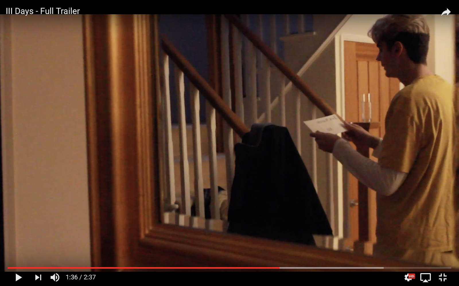
The issues that the trailer opens up, involve society’s sense of insecurity about our personal safety in an age of surveillance and internet cybercrime. Jack’s home, a warm haven with soft lighting, locked doors and a comfortable buffer of wealth, is disturbed by unexplained threats and intrusions. He is plunged into a state of uncertainty and vulnerability in the very place where he should be safe. This is suggested by visual codes like reflective surfaces (the mirror, the silver globe bowl) which imply that someone else is spying on him, that there is a voyeur in the house. Who is doing the looking?
We were able to convey through visual codes and camera work; by contrasting between the safe environment of Jacks home, and the illusion of someone watching him. Therefore when constructing specific scenes we placed our protagonist in reflective shots to capture the essence of personal invasion.


Subscribe to:
Comments (Atom)
LUCY SPALDING CANDIDATE NUMBER 1666 CLAREMONT FAN COURT SCHOOL 64680 I worked with SARAH MILLARD 1648 , MAX GREEN 1629, ...

-
 We constructed our BBFC using photoshop . Due to our film opening containing moderate threat along with infrequent mild violence, we dec...
 -
Film Treatment by Lucy
-
 The issues that the trailer opens up, involve society’s sense of insecurity about our personal safety in an age of surveillance and inter...