Monday, April 27, 2020


LUCY SPALDING
CANDIDATE NUMBER 1666
CLAREMONT FAN COURT SCHOOL 64680

I worked with SARAH MILLARD 1648MAX GREEN 1629,  YUE CHUN CHAM 0972

Our brief was to make film trailers (full and teaser) for a fictional thriller film. The title of our film is III DAYS. I have collated diversified research posts as-well as developed plans involving our film opening, III DAYS. These of which can be found below on the main blog roll below incorporated within diversified platforms and tools. This includes Twitter, Facebook, Instagram, YouTube, Google Forms, Photoshop, Piktochart, Pinterest, Visme, Canva, Prezi, SlideShare, Wix, final cut pro and adobe after affects. 

EDITING:
While everyone has been involved within the final production, we each contributed with differing approaches when it came to editing. Moreover I excelled when editing the newspaper and investigation board. Here I utilised multiple hard cuts, with short burst clips. In essence, enigma is quickly established as the whole image is hidden from the audience, but instead is portrayed in sections. This can also be seen when delivering the newspaper report scene. 

DIRECTING:
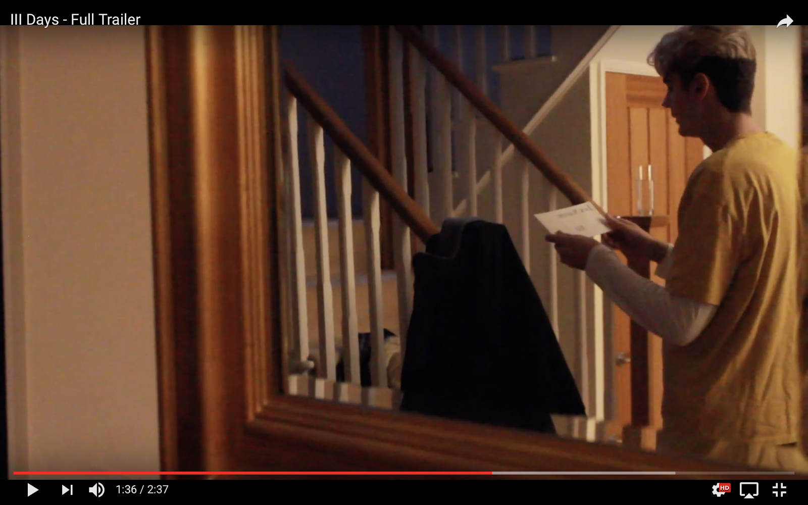
My main directing role consisted of integrating reflective surfaces to capture the more prominent visuals. The concept behind this was to further allude to the audience that he's being unknowingly watched. Here I led the process by selecting the most effective surfaces, as well as controlling the angle and lighting used.

CAMERAWORK:
During the trailers filming process, I took independence when integrating more interesting camera shots into each scene, equally building greater suspense. In particular, this can be seen when our protagonist Jack Masters, recieves his third and final letter. The utilisation of a match shot along with shot reverse shots to captures his facial expression and after one of the trailers most detrimental scenes.  

Saturday, March 7, 2020

CONSTRUCTION: FILM POSTER

I utilised the editing software Adobe Photoshop when creating a film poster as one of my three products as a marketing tactic. Through this process I was able to further establish my perception of important key conventions, and furthermore was able to develop my editing skills as I grew more familiar with the platform. 


To start I began by changing the curves of the picture to develop a deeper contrast between the highlights and shadows involved within the background image. This provided an area of lighter distinction which formed in centre page. 


I also added a monochrome tint of about 5% to the poster, while leaving the red strings exposedThe use of the monochromatic colour provides visual cohesion which helps to support the tone of the poster through the connotative colour created. The relative absence of hue contrast introduces a sinister style. 


Imported visuals added consisted of the Title, Billing board, Awards and Actor names; all of which are the conventions of a successful film poster. I further edited the film award/ festival names to increase sophistication and establish the films credibility. A red outline was used as a technique to grab the audiences attention. 


Moreover, after realising the lack of excitement as expressed through the poster, I decided to incorporate a dripping blood effect onto the "III" of the title. Furthermore, I favoured a more captivating effect, this of which I was able to achieve by linking the poster visuals with the Title in a coupled approach. This signifies to the audience the relationship and impact of time within the plot. The left side of the title incorporates less string, while the right provides an overwhelming extent which is to be seen as a reflection to the plot thickening

I added a tagline and social medias to follow the typical conventions associated with a respectably credited thriller film poster. shadow itself represents the blocking out of light, the addition of shadows behind the varying text formats symbolise a lurking darkness, which can be further connoted to resemble uncertainty

My Final Product:

Monday, March 2, 2020

CONSTRUCTION: NOTIONS OF LOOKING

The issues that the trailer opens up, involve society’s sense of insecurity about our personal safety in an age of surveillance and internet cybercrime. Jack’s home, a warm haven with soft lighting, locked doors and a comfortable buffer of wealth, is disturbed by unexplained threats and intrusions. He is plunged into a state of uncertainty and vulnerability in the very place where he should be safe. This is suggested by visual codes like reflective surfaces (the mirror, the silver globe bowl) which imply that someone else is spying on him, that there is a voyeur in the house. Who is doing the looking?

We were able to convey through visual codes and camera work; by contrasting between the safe environment of Jacks home, and the illusion of someone watching him. Therefore when constructing specific scenes we placed our protagonist in reflective shots to capture the essence of personal invasion.

Wednesday, February 12, 2020

CONSTRUCTION: BBFC CERTIFICATE


We constructed our BBFC using photoshopDue to our film opening containing moderate threat along with infrequent mild violence, we decided a classification of 15 was appropriate. The next age classification, an 18, would need to demonstrate 'sadistic threat'. Our category allows violence to be strong but should not dwell on infliction of pain or injury. The strongest gory images are unlikely to be accepted.


Monday, February 10, 2020

CONSTRUCTION: IDENT

Loading...
Loading...

LUCY SPALDING CANDIDATE NUMBER 1666 CLAREMONT FAN COURT SCHOOL 64680 I worked with  SARAH MILLARD 1648 ,  MAX GREEN 1629,  ...